Design for the landing page of the AIM division of Nicomax
Automated infrastructure management (automated infrastructure management) - the complex is needed in order to keep records in the database of all lines and all links that are connected on cross fields in data centers in order to manage switching on the cross field.
Goal
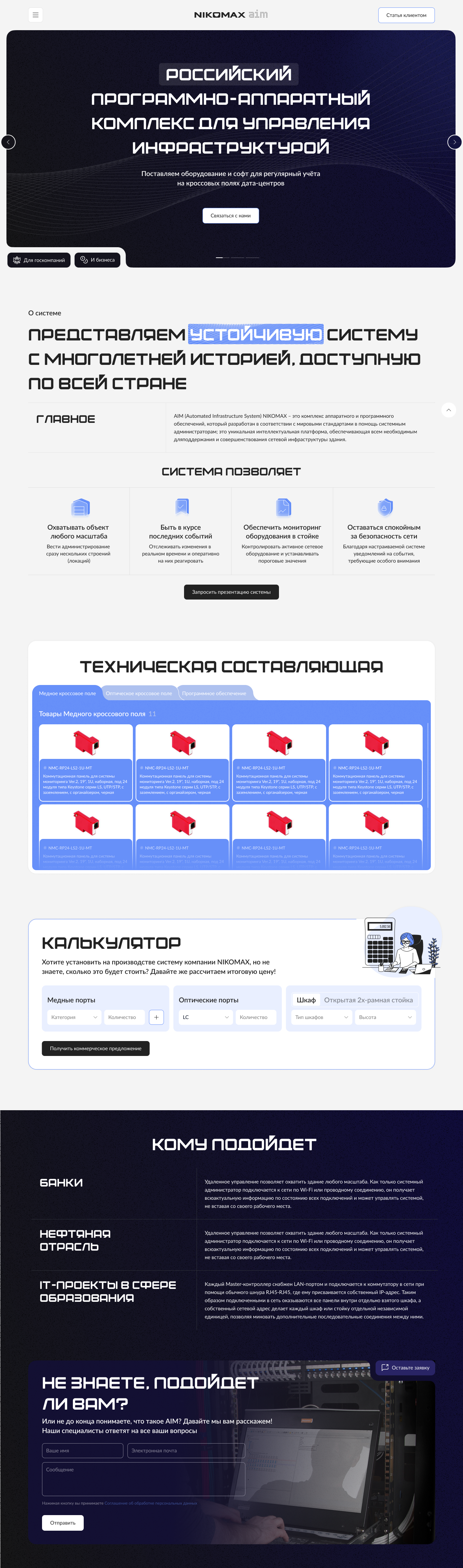
The goal of developing the landing page design was to create an attractive and informative page that could attract the attention of potential customers. The main objectives included providing clear product information, demonstrating the benefits and capabilities of the aim system, and simplifying the ordering and information request process.
Implementation
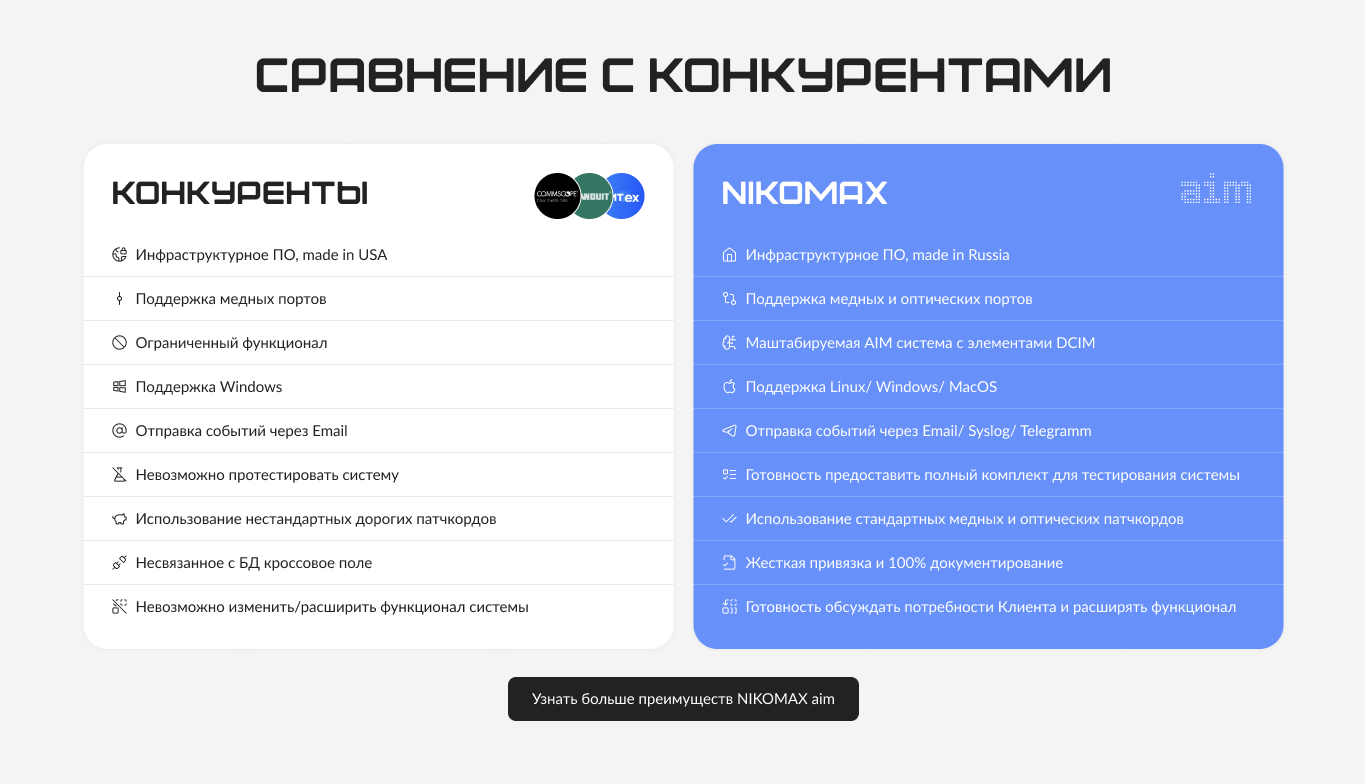
Having examined the scope of the company’s activities, it became clear that the system is quite complex and for its acquisition by a potential client it is necessary to carry out a lot of preparations. We analyzed the current page on the Nicomax website dedicated to this system. As a result, some problems were identified - the page was not structured, was not very informative and did not perform a key function - to encourage visitors to purchase a product or leave an application. During the analysis process, we identified the key needs of the target audience - quick and convenient access to submitting an application, a visual presentation of the product and highlighting the opportunities that the aim system can offer. Having analyzed foreign competitors, we noted that it is very important to clearly answer most of the main questions on the page. The client may have questions about what area the system is suitable for, why it is beneficial for the client to purchase and use AIM right now, what is the installation process for this system. After collecting information and analysis, we began creating a landing page prototype. Subsequent detailed development of each block included visual design, development of the structure of the landing page and each block as a whole, development of layout versions for the resolutions of all devices, as well as a UI kit. Although Nicomax's corporate accent color is orange, we decided to use cool shades for the main colors, such as blue, cyan, gray, which can intuitively remind the user of fiber optics. But in order not to lose the visual connection with the company, we specifically added Nicomax colors. And for greater atmosphere, a design element in the form of lines, reminiscent of a cross-country field, was stretched across the entire landing page. During the design, we focused a lot of attention on telling the potential client about the system in detail, but as briefly as possible, and giving the opportunity to leave a request in almost any block on the page. Our client has no Russian competitors, and foreign ones have ceased their activities in the country. Therefore, based on our analysis of the scope of activity of the company and their competitors, we decided to develop the design of additional blocks - comparison with competitors whose companies we are replacing, which will leave an unprecedented impression of the system on future clients, and this information will also improve the position of the landing page in search results.
Results
As a result, we received a clearly structured landing page about the AIM system, which will give the user a complete understanding of the product and increase conversion.