A user's trust in a site depends on what is posted on it. It's not just individual elements of the site that matter, but all of them together. The degree of trust determines the probability of conversion and, accordingly, profit.
Let's look at the nuances using examples from the topic “service station services " and show you how to make a website\landing page that will be trusted.
The first is the most important one
First screen – this is the most important part of a user's session, especially if you have a landing page or a single page. In any case, the first screen accounts for 80% of all interaction time with the site. This is the first thing that the user sees when clicking on the ad.
More than half of all site visitors pass through the first screen. If they don't see a response to their request within 3-4 seconds, they will leave. A big mistake is a slurred or universal first screen. Even the most accurate keyword and ad won't generate conversions if the landing page doesn't match or partially match the user's request.
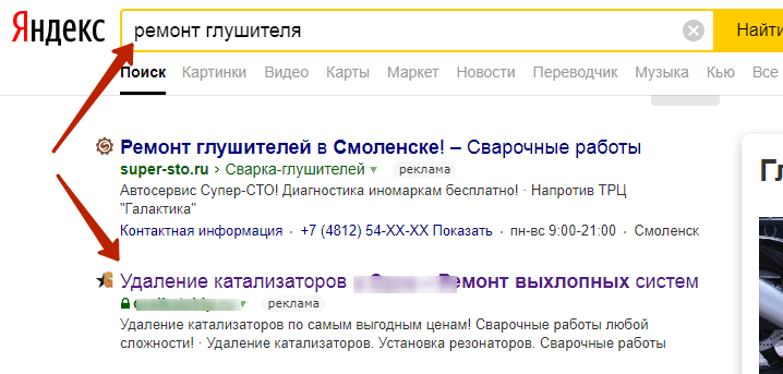
For example, here is the ad:
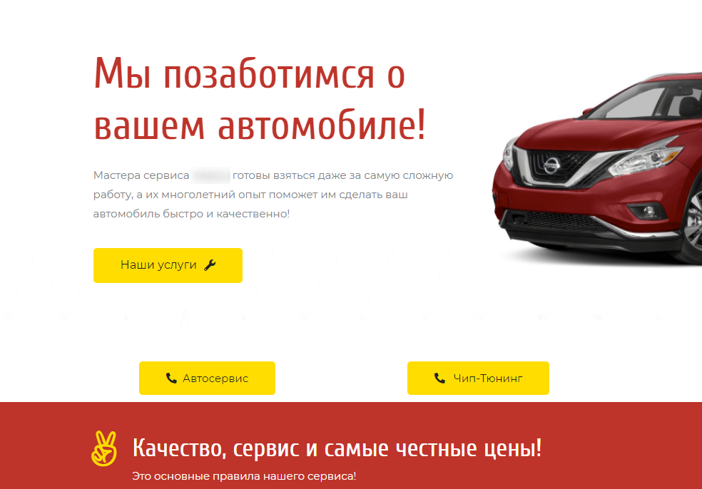
And here's where it leads:
There is not a word on the page that the company is engaged in the repair of silencers, only the most general information. You need to really want to " rummage” through the menu and find the right service. Most users can simply close the site.
Strictly speaking, there is another problem here – the ad doesn't respond to the user's request, and it is highly likely that the ad doesn't work as efficiently as it could.
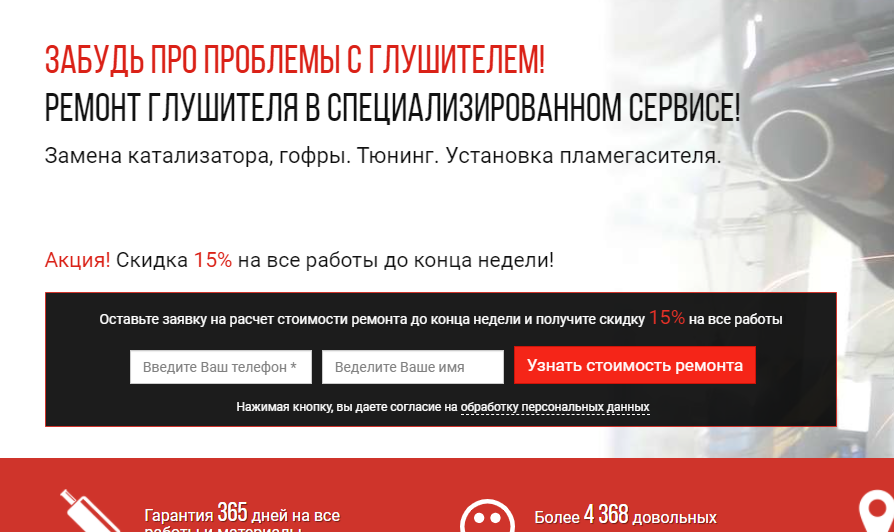
And here is an example of a successful link "ad – the first screen of the landing page". Here we see a clear match of the search query to the title on the page, plus there is an advantage with a clear wording:
Advertisement:
And on the landing page, we see:
By structure, the first screen includes the desired title, subtitle (if necessary), and call to action. All these elements should be at the very top to motivate you to take a targeted action.
All other content can be safely placed below the first screen, it is auxiliary, removes objections, tells you more about the service, where to get it, etc.
Before creating content for your site, you should know: what does a potential customer need to know in order to make a purchase decision? What questions does he care about? Focus on the questions and objections that your target audience may have, so that you can provide comprehensive answers in a timely manner and speed up the process.
What and where to post on the site is the choice of everyone, we will not dwell on this for a long time. So, what is important to follow in order for users to trust you?
What should I show on my site for a high conversion rate?
Obviously, it doesn't make sense to write a lot of text about the company on the landing page, as well as other side information. We need facts about the company and emphasis on benefits for customers, not from the position of "What we have", but from the position of"What we guarantee you".
Также, как и в рекламных текстах, просто написать обещания – мало. Если вы о чем-то заявили, нужно это подкреплять цифрами и доказательствами, фото- и видеоматериалами. Факты и только факты!
Display all the benefits that the client receives in figures, and tell them in more detail how long you offer these benefits and why.
The manager's photo and name add "humanity" to the site. This element increases trust. Your task is to prove to your target audience that you are a living company that is ready to take responsibility, and not a one-day company that will disappear. Trust is especially important in the b2b sphere.
What else should users pay attention to?
If you produce your own product, show the production process in photos or videos. Make an overview of the production, warehouse, and personnel.
If your company has a lot of experience, post photos of successful projects, case studies, recommendations, and reviews.
Be sure to share the address where you can be found.


